Choco Pack
✶

Brand Strategy
Yuzzu needed to stand out in a cooler full of maximalist seltzers without losing its craft credibility. We positioned the brand around bright restraint — bold enough to be seen, refined enough to be trusted.
(WHAT WE DID)
Vision, mission & values
Audience personas
Positioning statement
Brand promise
Big idea



Verbal Identity
Yuzzu's voice is Bright, Confident, and Concise — copy stays short and citrus-sharp, never over-explaining a drink that's meant to be effortless.
(WHAT WE DID)
Voice persona
Voice pillars
Elevator pitch
Value propositions
Message library
Visual Identity
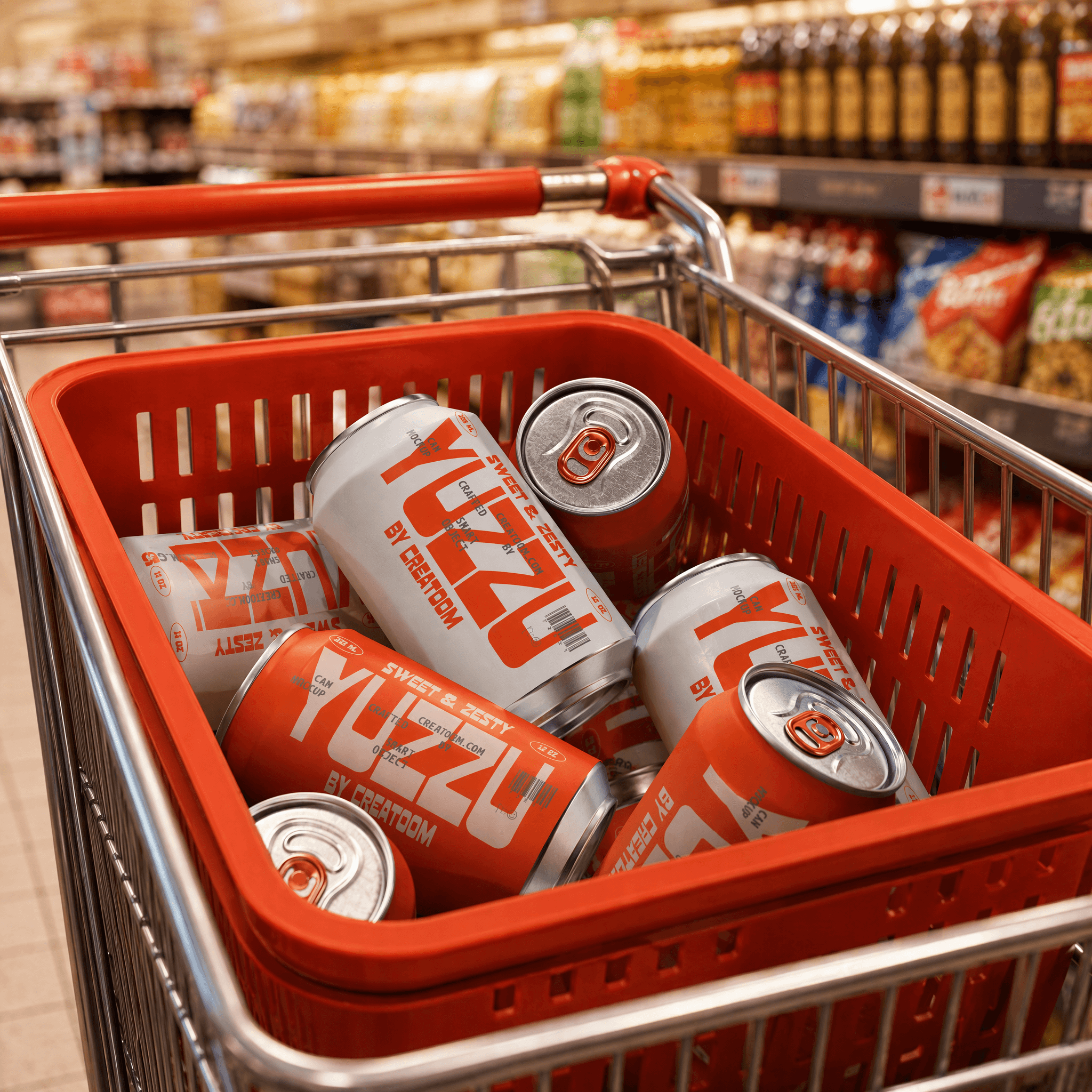
The identity centers on a saturated yuzu-yellow and a faceted mark that mimics citrus zest, engineered to read instantly from across a crowded cooler aisle.
(WHAT WE DID)
Creative brief
Logo system
Color/type
Can system
Brand guidelines
Art Direction
Photography leans into saturated color and tactile detail — condensation on the can, a peel of zest mid-air — keeping every shot as crisp as the drink itself.
(WHAT WE DID)
Photography
Product Styling
Motion

keep scrolling for the next project
Clay Animation
✶